
Tool /
Covert Figma to live website
In the previous article, we explored how to create responsive design files in Figma. In this guide, we’ll build on that foundation and show you how to efficiently convert those responsive designs into a fully functional responsive website.
Plugin Overview: Figma to Creght
「Figma to Creght」 is a productivity plugin designed for both designers and developers. It enables you to convert Figma layouts directly into Creght’s code structure, streamlining the workflow from design to implementation.
🔗 Plugin link: Figma to Creght
Step-by-Step Guide
Step 1: Install the Plugin
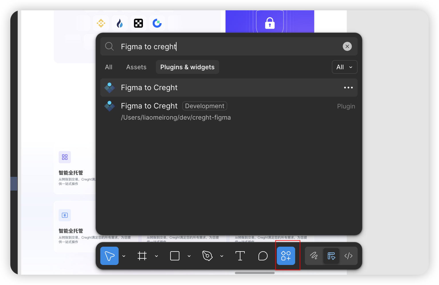
In Figma, search for “Figma to Creght” in the Plugins menu.
- Click Run to complete the installation.
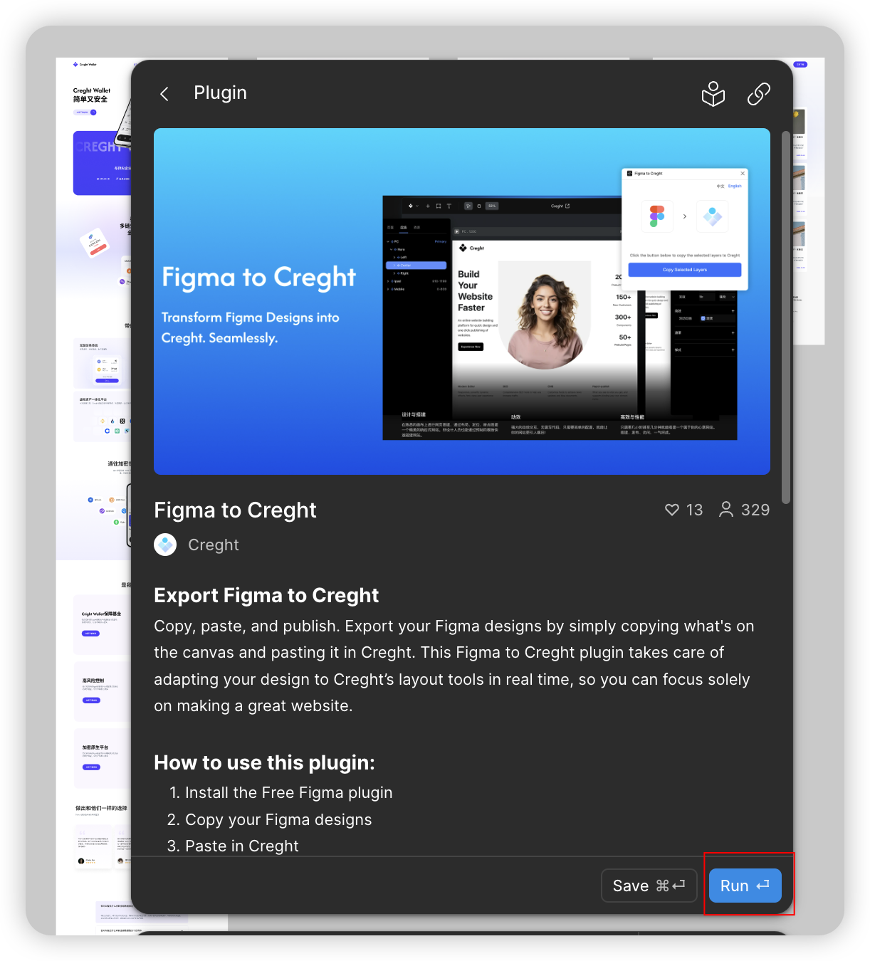
Step 2: Copy Design Layers
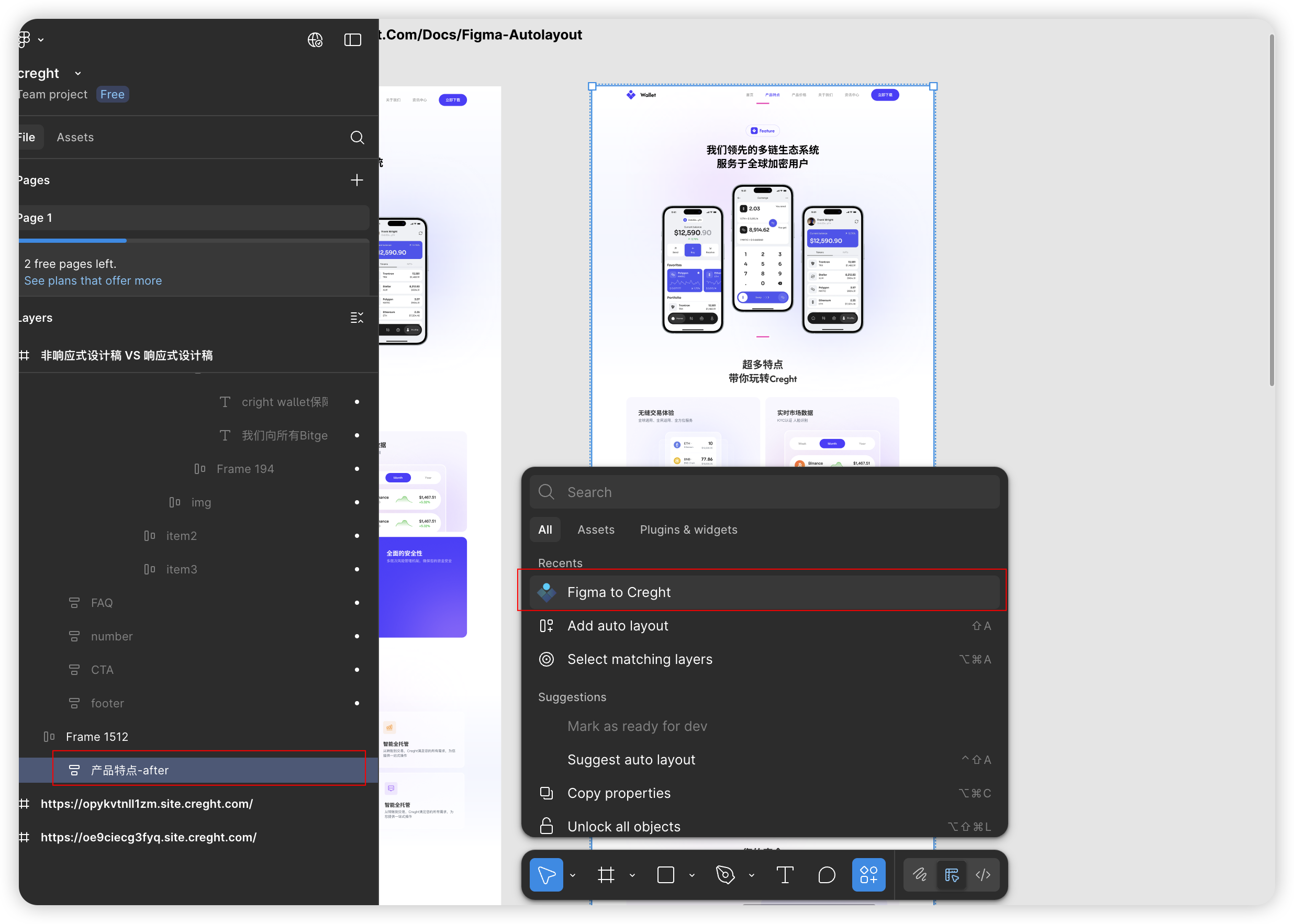
- In Figma, select the layers you want to export.
From the Plugins menu, choose “Figma to Creght.”
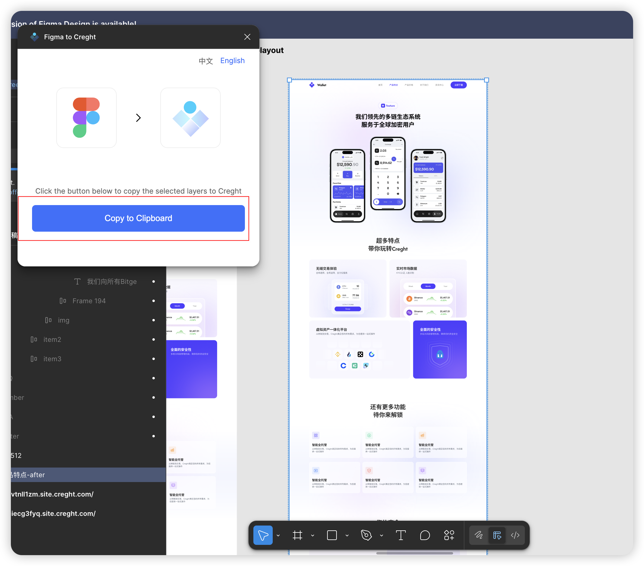
- Wait for the plugin to parse your selection (this usually takes just a few seconds).
Click Copy to Clipboard in the popup window.
Step 3: Paste into Creght
- Open the Desktop Breakpoint view in the Creght editor.
Paste your design using
Ctrl+V(Windows) orCmd+V(Mac).Tip for beginners: Try pasting your design section by section. This makes it easier to locate and fix layout issues.
Step 4: Adjust for Responsive Layouts
After importing, you’ll typically need to fine-tune layouts for different breakpoints. Below are common scenarios and solutions:
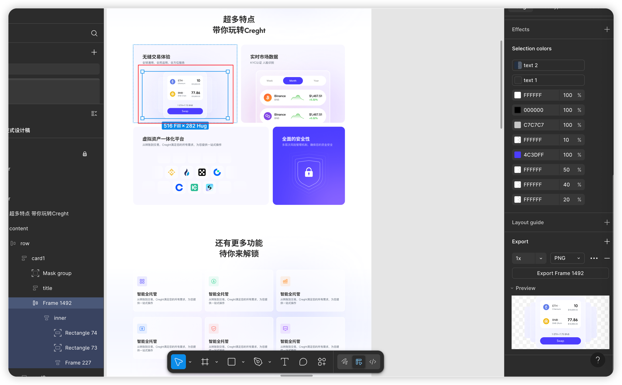
1. Merged Layers
- When to use: Logos with text, complex illustrations.
Solution: Export as an image and re-upload to Creght.
2. Layout Direction
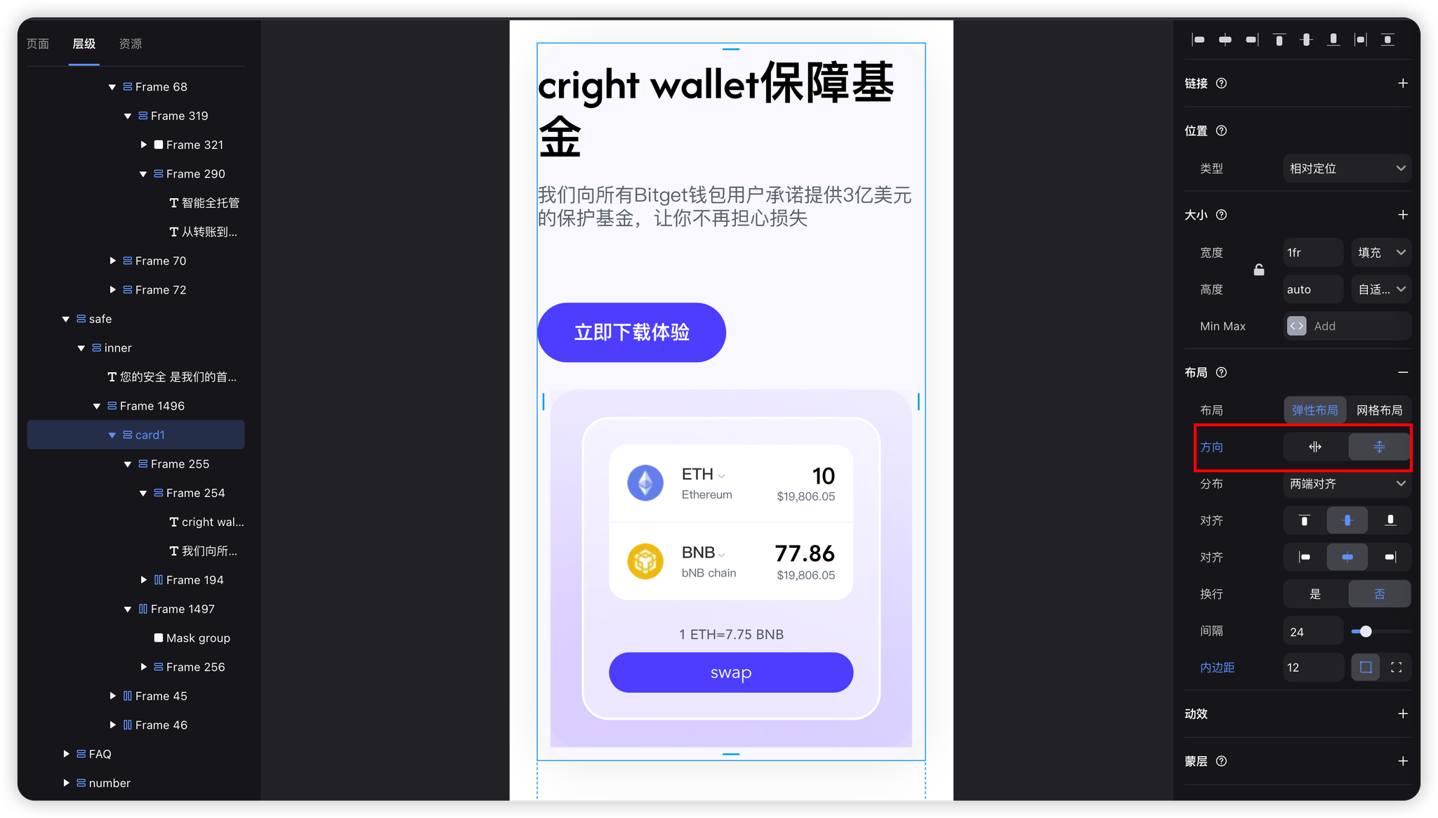
- Mobile view often requires switching from horizontal to vertical layouts.
3. Spacing Adjustments
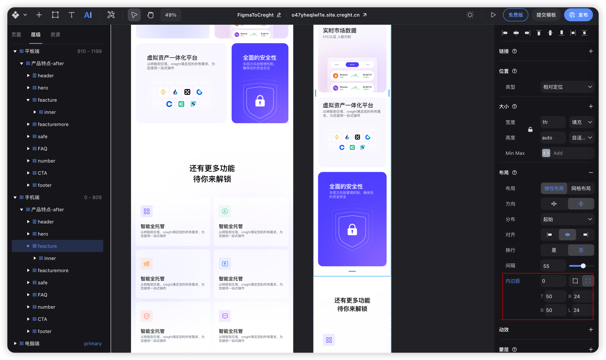
Mobile view usually benefits from reduced padding to maximize space.
4. Grid System Responsiveness
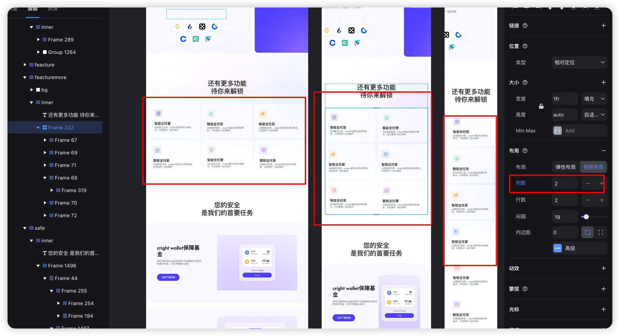
Adjust the number of grid columns for each breakpoint.
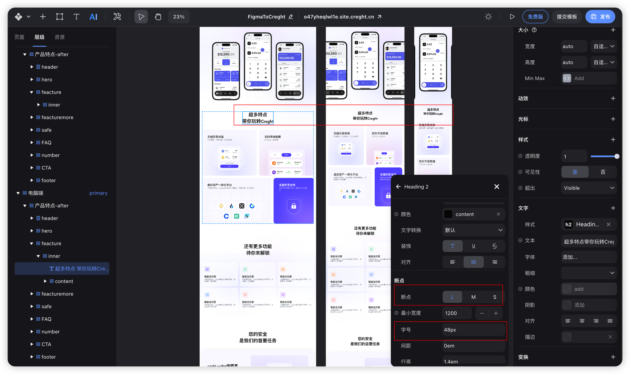
5. Font Size Scaling
Best practice: Use text styles to manage font-size changes consistently.
6. Unit Conversion
Convert fixed sizes into percentage or fractional units.
Example: set left card to
2frand right card to1fr.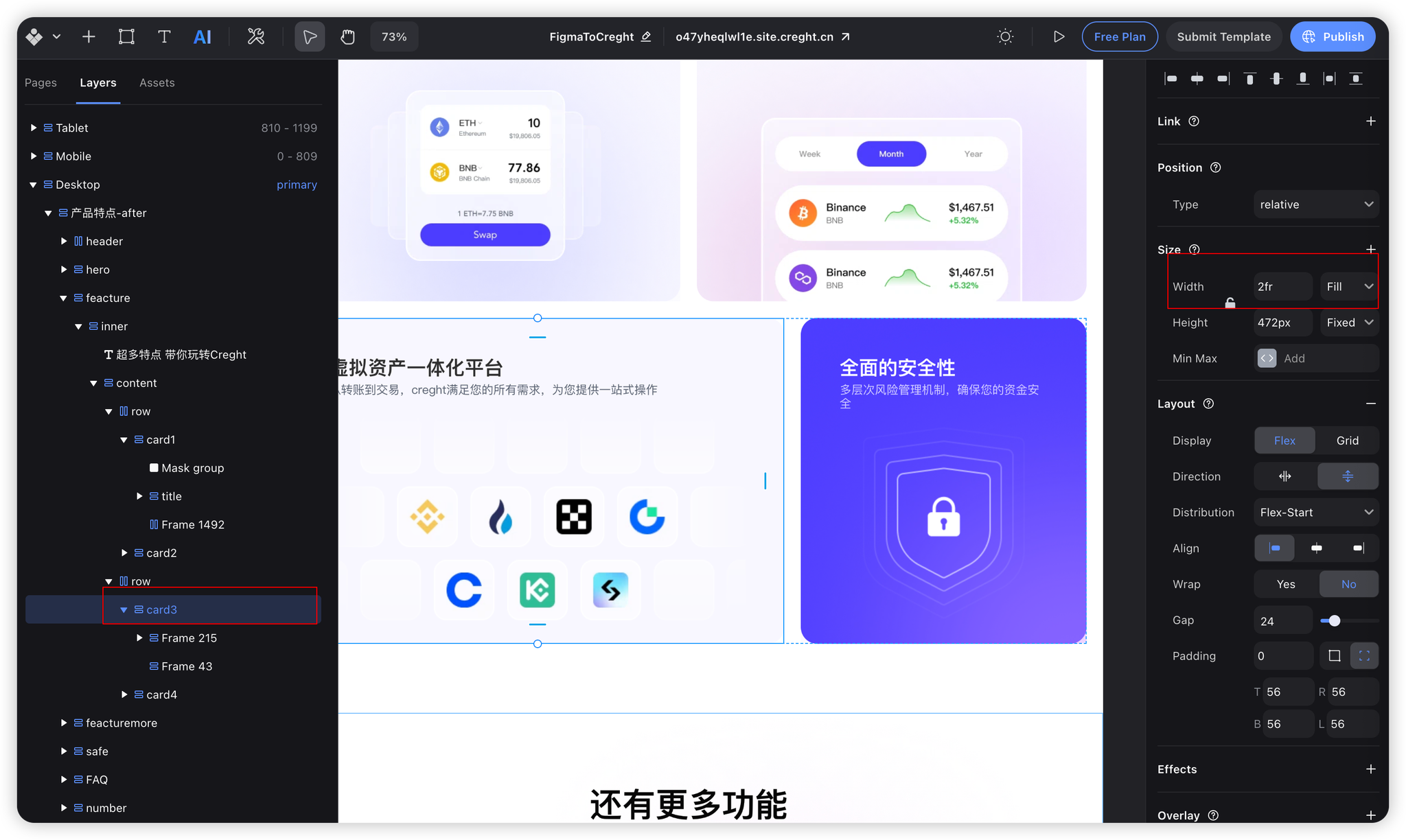
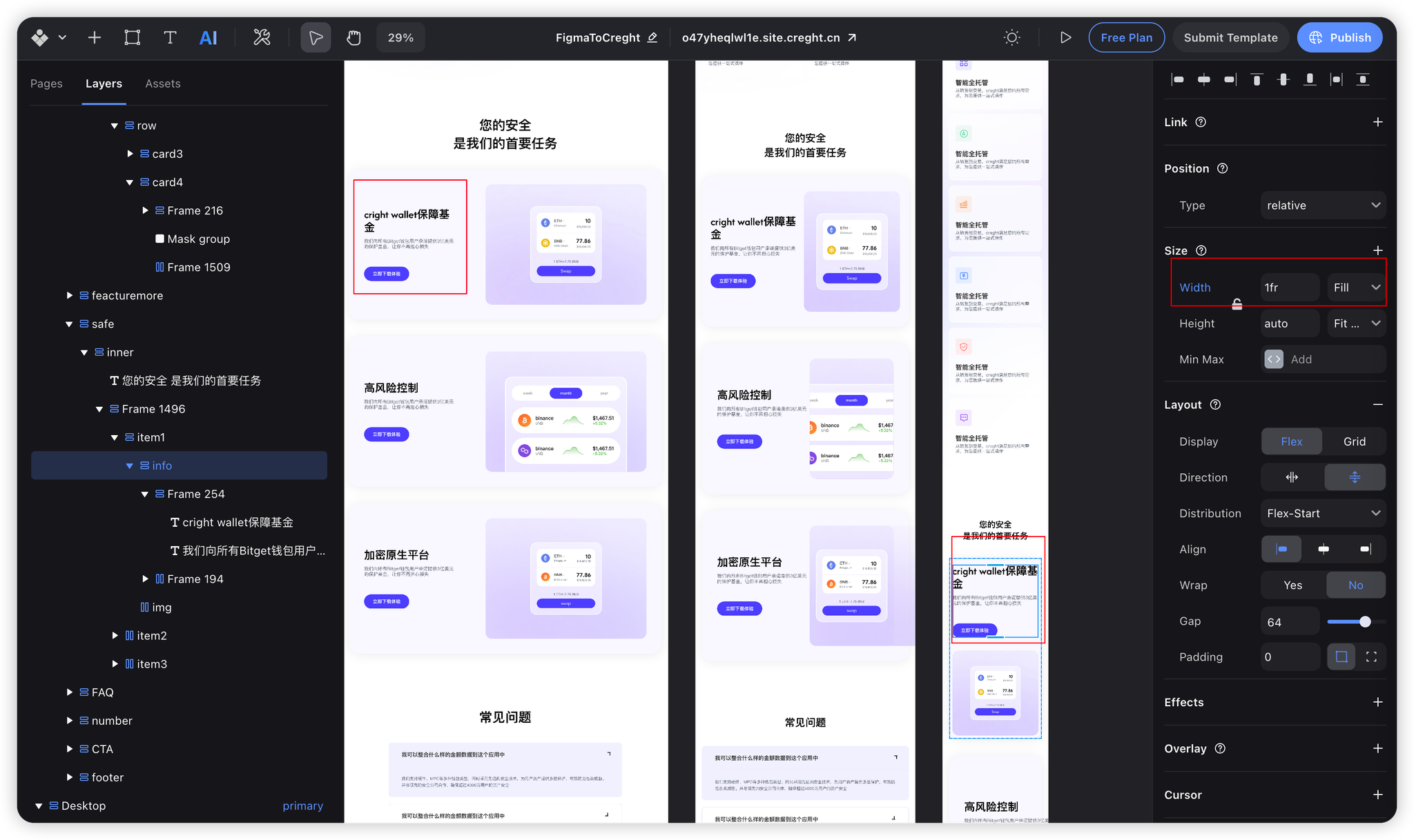
Alternatively, define different dimensions per breakpoint (e.g., fixed on desktop, fluid on mobile).
FAQs
1. Why do some images look blurry?
- Reason: The plugin compresses images for faster conversion.
- Fix: Re-upload high-resolution images manually.
2. Why aren’t all Figma styles replicated?
Certain Figma features can’t yet be fully translated:
- Multiple fills in Frames (Creght supports only the first).
- New grid layout features (coming soon).
- Gradient angles and advanced effects.
Figma vs. Creght Property Mapping
| Figma Property | Creght Equivalent |
|---|---|
| clipContent | Overflow: hidden |
| Ignore Auto Layout | Set component position to absolute |
Conclusion
By following this tutorial, you’ve converted a Figma design into a responsive web layout in Creght. In the next article, we’ll take it a step further—adding interactivity and animations before publishing your design as a live, responsive website.