
Design /
Breakpoints in Creght
Breakpoints allow you to adapt your design across PC, Tablet, and Mobile screens. Here’s how to use them:
Step 1: Adjust Text Size
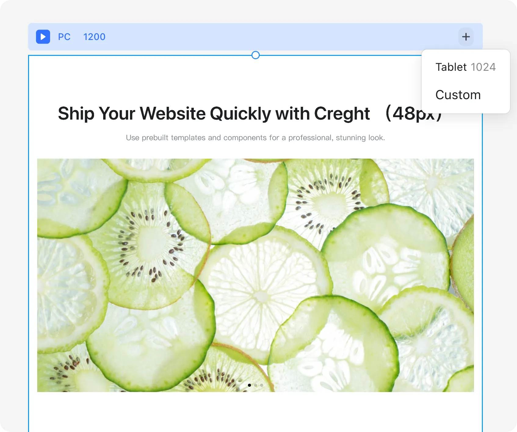
When designing on PC, a headline set to 60px looks great. But on Mobile, it may appear too large.
- Switch to the Mobile breakpoint.
- Reduce the font size (e.g., from 60px to a smaller size).
Creght provides three default breakpoints: PC, Pad, and Mobile.
You can also click the “+” button in the breakpoint bar to add system presets or create custom breakpoints.
Step 2: Change Layouts
Different devices call for different layouts:
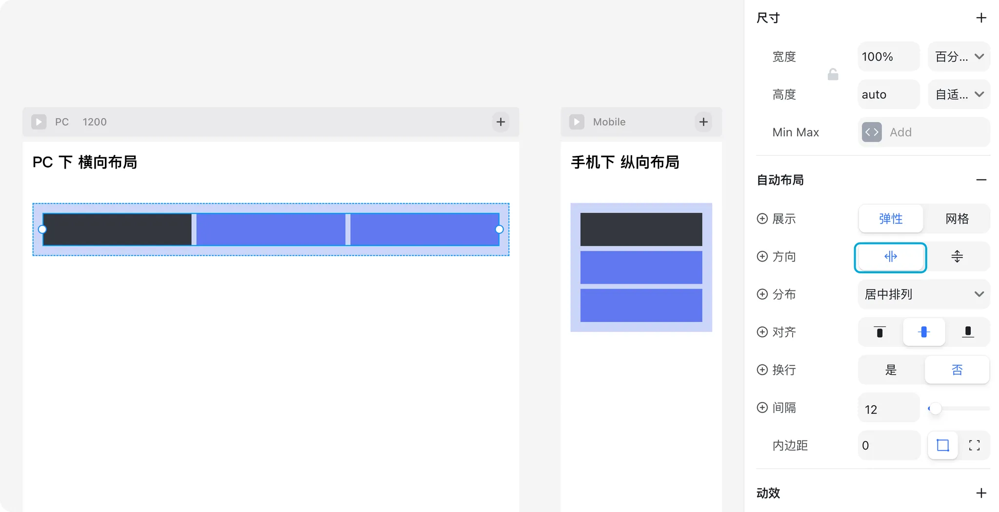
- PC: More space → content arranged horizontally.
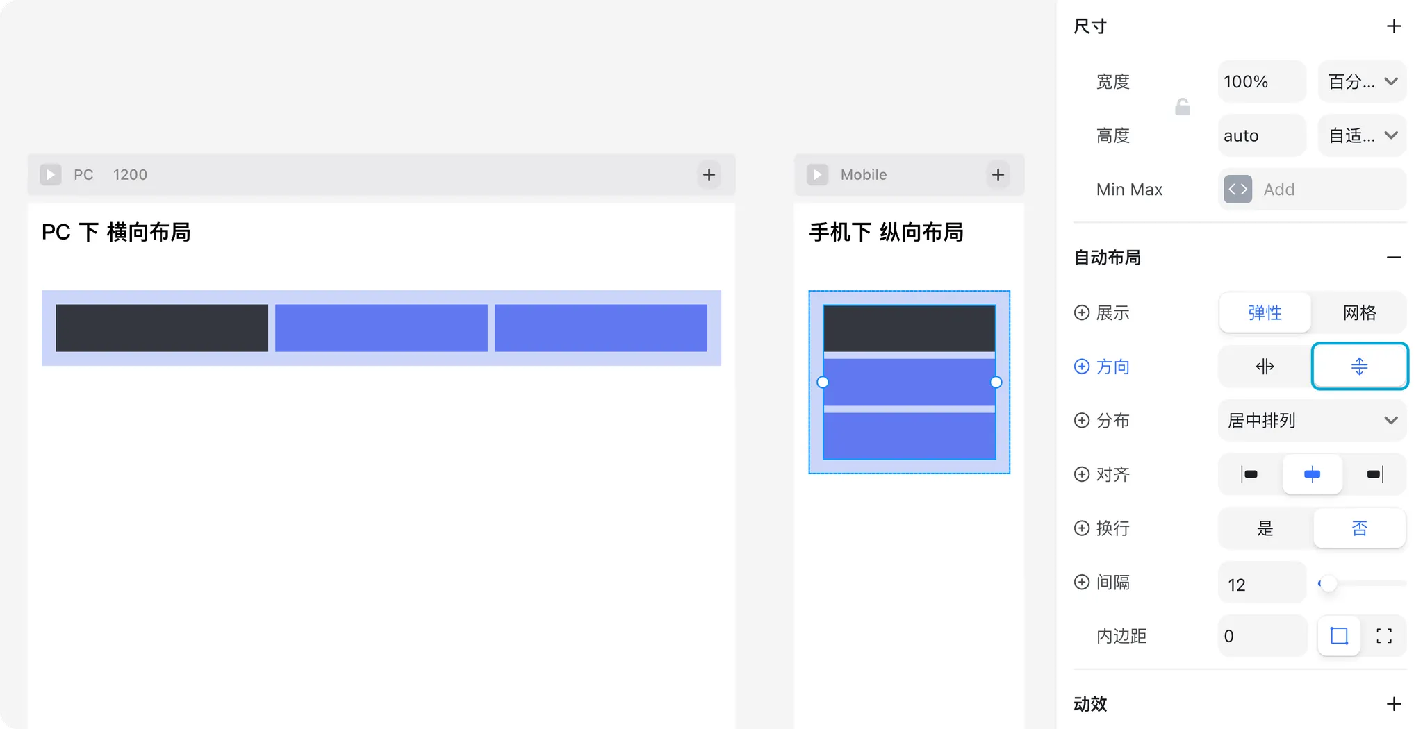
- Mobile: Limited width → content arranged vertically.
To achieve this:
- Select the container (Frame).
- At the PC breakpoint, set direction to horizontal.
- At the Mobile breakpoint, set direction to vertical.
Step 3: Use Component Variants
For shared elements like navigation, you may want different versions for PC and Mobile.
Create a navigation component with two variants: PC and Mobile.
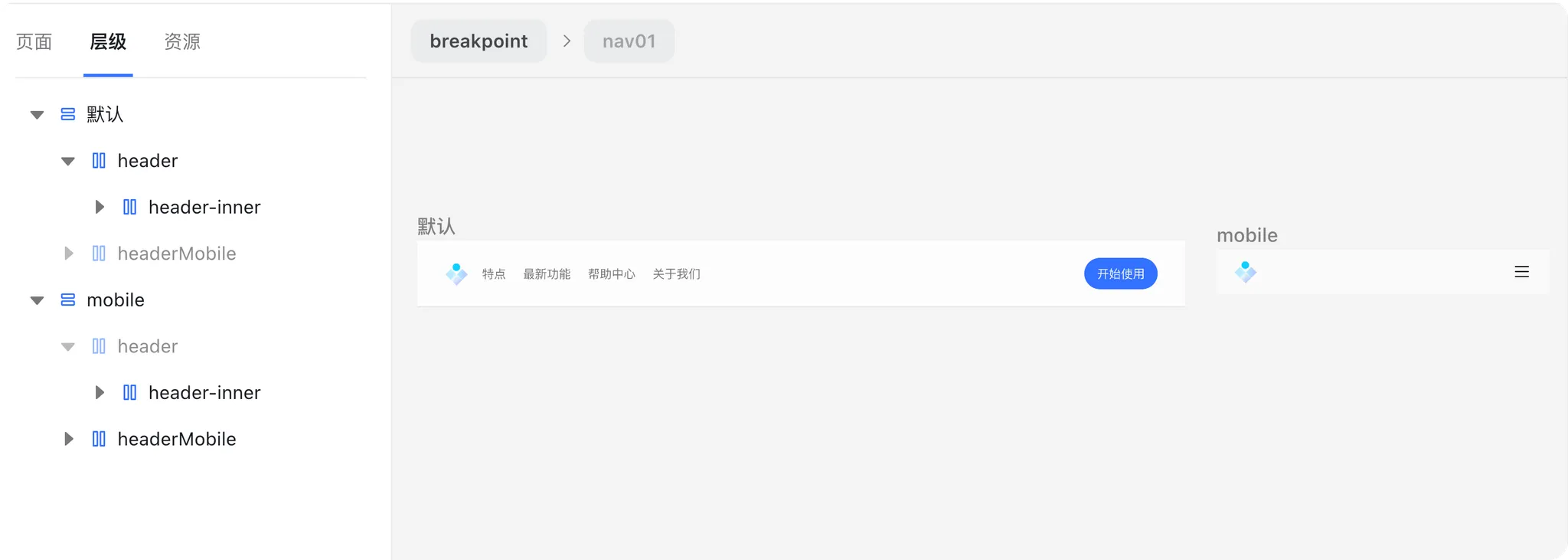
(Tip: You can find a navigation template in Insert Panel → Header.)- Switch to the Mobile breakpoint.
- Select the Mobile variant for the navigation.
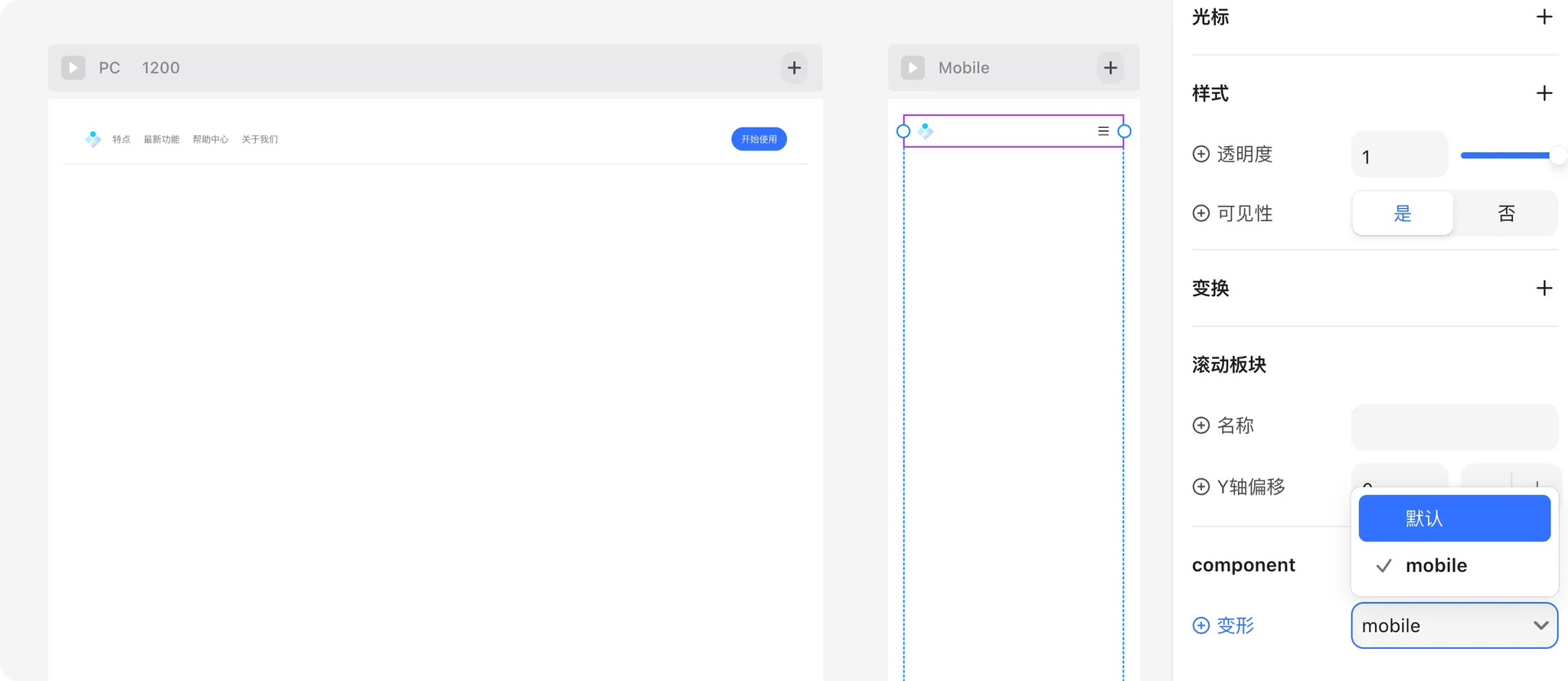
Now your navigation adapts seamlessly across devices.
✅ Summary
Breakpoints make your website responsive and user-friendly.
They allow you to:
- Adjust font sizes for different screens
- Reorganize layouts for better readability
- Swap component variants to match device needs
With just a few breakpoint settings, your site will look great on any device.